Follow the widget list as it appears in the wxGlade main window.
This prompts for a wxFrame or a
wxMDIChildFrame. A vertical
wxBoxSizer is appended. In the properties
window you can choose the styles and you can add an icon.
This prompts for a wxDialog or a
wxPanel in top-level. In the
“Properties” window you can choose
the styles and, for the dialog, you can add an icon.
This allows you to add a panel to a sizer. In the “Properties” window you can choose the styles.
This produces a wxSplitterWindow and two
associated panels as well. You can choose vertical or horizontal
splitting. In the “Properties”
window you can choose the styles and the sash position.
Be careful not to put too large a widget in a splitter panel, because while it might appear normal in the design window, when you run your program one of two panels will take all the available space and the other will shrink to the minimum size possible.
This produces a wxNotebook and one panel
for each tab. In the “Properties”
window you can add and remove tabs, which appear in a list.
This produces a wxButton. You can enter
a caption and the “default” flag. If you want to add an
image you need a bitmap button (see the section called “Bitmap Button”).
This produces a wxBitmapButton. You can
set the “default” flag on or off. You also can choose
the bitmap for the button and, optionally, the bitmap for the
disabled status. Refer to the section called “Specifying the Path of Bitmaps” for
bitmap path specifications.
This produces a wxRadioButton. In the
“Properties” window you can enter
the text, and the status, clicked or not, and the style.
This produces a wxSpinButton. In the
“Properties” window you can enter
the range and the value.
This produces a wxCheckListBox. In the
“Properties” window you can enter
the choices, the selection and the style.
This produces a wxCheckBox. In the
“Properties” window you can enter
the text, and the status, checked or not, of the button.
This produces a wxChoice. In the
“Properties” window you can enter
the position of the selected item starting from 0. You can edit the
list of choices.
This produces a wxComboBox. In the
“Properties” window you can enter
the position of the selected item starting from 0. You can edit the
list of choices.
Click on the “” button to consolidate your changes, they are lost without clicking.
This produces a wxDatePickerCtrl. In the
“Properties” window you can enter
the style.
This produces a wxGenericCalendarCtrl. In
the “Properties” window you can set
the style.
This produces a wxGrid. In the properties
window you can set the style, the row number, the label size, the line
and background color and the selection mode. You can edit the list of
columns. Also you can choose to let wxGlade to create the grid or
leave it to the user code.
This produces a wxHyperlinkCtrl. In the
property window you can enter the label, the URL and also set the
style.
This produces a wxListBox. In the
“Properties” window you can enter
the position of the selected item starting from 0. You can edit the
list of choices.
This produces a wxPropertyGridManager. In
the “Properties” window you can set
the style.
This produces a wxRadioBox. In the
“Properties” window you can enter
the dimension. The style determines whether the dimension is the
number of rows or columns.
You also can set which button is selected with the “Selection” spin starting from 0. You can edit the list of choices.
This produces a wxSlider. In the
“Properties” window you can enter
the value, the range and also set the style.
This produces a wxSpinCtrl. In the
“Properties” window you can enter
the value, the range and also set the style.
This produces a vertical or horizontal
wxStaticLine. In the
“Properties” window you can tell
wxGlade whether to store the object as an attribute of the frame
class.
This produces a wxStaticBitmap. You will
be prompted for the bitmap path. Refer to the section called “Specifying the Path of Bitmaps” for bitmap path specifications. In the
“Properties” window you can set the
style and you can tell wxGlade whether to store the object as an
attribute of the frame class.
This produces a wxStaticText. In the
“Properties” window you can enter
the text, set the style and tell wxGlade whether to store the control
as an attribute.
This produces a wxTextCtrl. In the
“Properties” window you can enter
the text and also set the style.
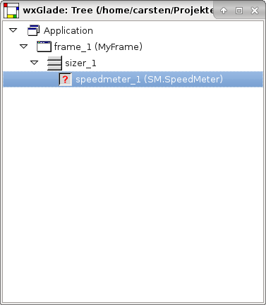
When you put a Custom Widget in the design window you will be prompted for a class name.
Note
Custom Widgets will not be shown in the design preview.
In the “Widget” tab of the “Properties” window you can set a number of custom attributes that will appear in the constructor call.
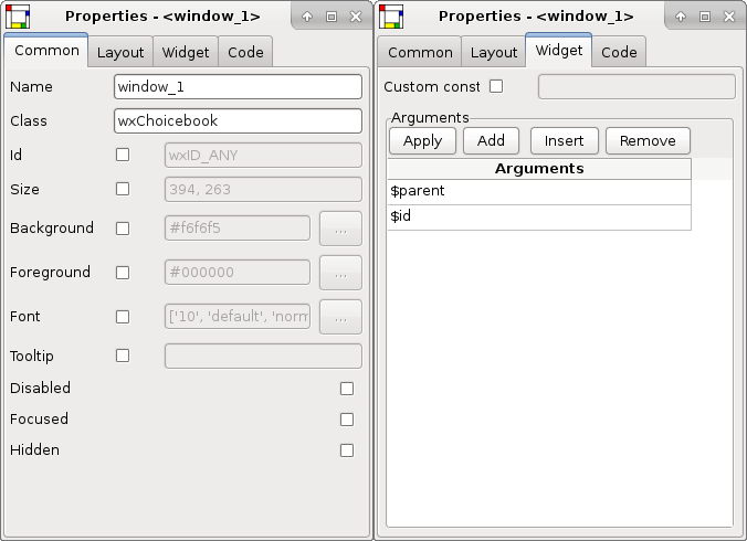
There are four attributes $id,
$parent, $width and
$height have a special meaning:
- $id
This attribute will be replaced by the own widget ID e.g.
wxID_ANY.- $parent
This attribute will be replaced by a reference to the parent widget.
- $width
This attribute will be replaced by the widget width.
- $height
This attribute will be replaced by the widget height.
These attributes have different effects in C++, Lisp, Perl, Python or XRC code generation.
For XRC you can use it to add custom attributes to the
resource object. To do so, arguments must have the following format:
“ATTRIBUTE_NAME:
ATTRIBUTE_VALUE”. For instance:
“default_value:10” is translated
to:
“<default_value>10</default_value>”.
Invalid entries are silently ignored.
You can use the property “Custom constructor” to specify a custom constructor like a factory method.
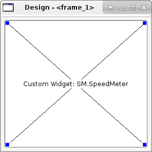
Example 6.6. Generated C++ code for the custom widget shown above
MyFrame::MyFrame(wxWindow* parent, int id, const wxString& title, const wxPoint& pos, const wxSize& size, long style):
    wxFrame(parent, id, title, pos, size, style)
{
    // begin wxGlade: MyFrame::MyFrame
    window_1 = new wxChoicebook(this, wxID_ANY);

    set_properties();
    do_layout();
    // end wxGlade
}
Note
Refer to the section called “Code Properties” for a description of declaration and assignment of additional functions and variables.
Example 6.7. Widget Custom Widget - AGW SpeedMeter

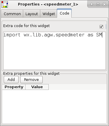
Generated Python code:
#!/usr/bin/env python
# -*- coding: UTF-8 -*-
#
# generated by wxGlade 0.7.1 on Sat Dec 19 11:11:39 2015
#

import wx

# begin wxGlade: dependencies
import gettext
# end wxGlade

# begin wxGlade: extracode
import wx.lib.agw.speedmeter as SM
# end wxGlade


class MyFrame(wx.Frame):
    def __init__(self, *args, **kwds):
        # begin wxGlade: MyFrame.__init__
        wx.Frame.__init__(self, *args, **kwds)
        self.speedmeter_1 = SM.SpeedMeter(self, wx.ID_ANY)

        self.__set_properties()
        self.__do_layout()
        # end wxGlade

    def __set_properties(self):
        # begin wxGlade: MyFrame.__set_properties
        self.SetTitle(_("frame_1"))
        self.SetSize((300, 300))
        self.speedmeter_1.SetSpeedValue(33)
        # end wxGlade

    def __do_layout(self):
        # begin wxGlade: MyFrame.__do_layout
        sizer_1 = wx.BoxSizer(wx.VERTICAL)
        sizer_1.Add(self.speedmeter_1, 1, wx.ALL | wx.EXPAND, 5)
        self.SetSizer(sizer_1)
        self.Layout()
        # end wxGlade

# end of class MyFrame
class MyApp(wx.App):
    def OnInit(self):
        frame_1 = MyFrame(None, wx.ID_ANY, "")
        self.SetTopWindow(frame_1)
        frame_1.Show()
        return True

# end of class MyApp

if __name__ == "__main__":
    gettext.install("app") # replace with the appropriate catalog name

    app = MyApp(0)